
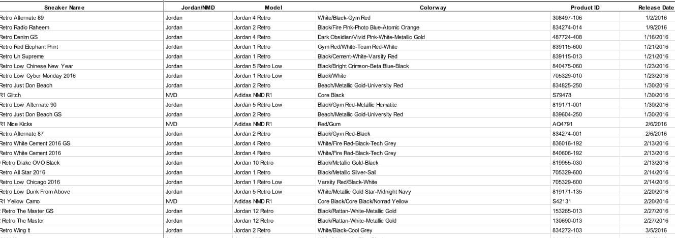

A couple of weeks ago we announced our Data Contest where we asked you, our loyal sneakerhead data nerds, to download some raw data and send us back your best analyses and charts. And you did not disappoint us. We were blown away by the number of entries we received and very impressed with the quality of work. In fact, there were so many great submissions it was hard to choose just one winner and even more difficult to include just ten charts in this blog post.
The charts we’ve included below are from the analyses that our team felt were the strongest, well thought out, or just cool visuals that we wish we would’ve made. We tried to use all of the charts we received “as is” to preserve the author’s intended visuals. In a couple of cases we had to recreate the charts provided.
The first chart below is from our grand prize winner who will receive $100 off their next purchase on StockX. After that are our two runner ups who will receive hoodies followed by seven honorable mentions who will receive t-shirts. There are another 30 people who sent in great entries that will also be receiving t-shirts but sadly we couldn’t put all of their charts in this post because the scroll would take longer than your Twitter feed.
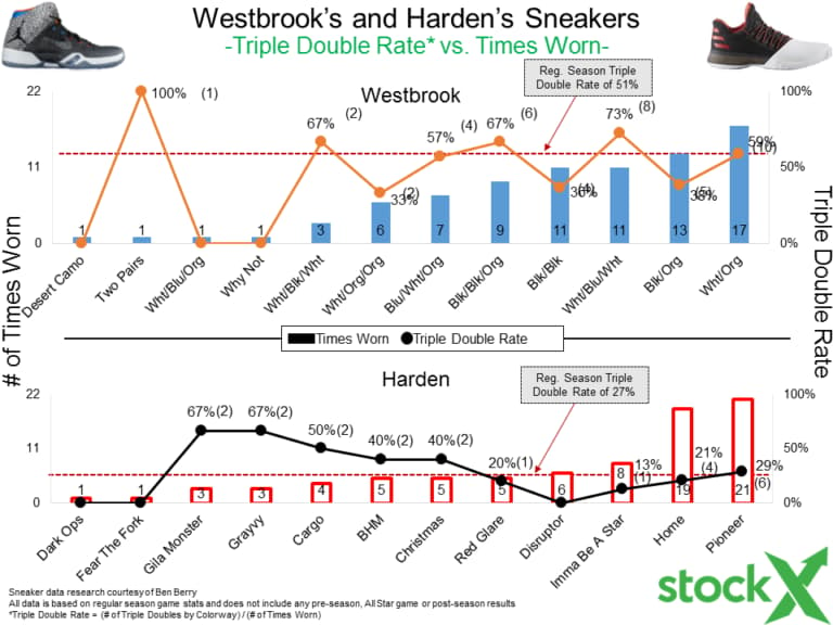
After analyzing the charts, reading the summaries, and pivoting the pivot tables, our team unanimously chose BigfootKix as the winner. Congratulations! Here’s a quick rundown of his analysis.
 Key Insights:
- BigfootKix sought to understand how investing entirely in Air Jordans or NMDs would compare to more conservative or straightforward investing methods. The two alternative investment methods he tested were buying an ETF that roughly follows the Dow Jones (ticker: DJIA) and buying shares in Nike (NKE) and Adidas (ADDY).
- For a Jordan investor (left columns above) purchasing ETFs yielded the highest annual return, followed by stocks and then sneakers.
- For an NMD investor (right columns above) purchasing sneakers yielded the highest annual return, followed by stocks and then the ETF.
- BigFootKix also included several other charts and a well-reasoned analysis that took into account other factors like sales, true profit calculations, transportation costs, highly-profitable sneaker outliers (Pharrell NMDs, etc.) and some assumptions around the availability of some releases.
- For these insights and more, BigfootKix is the winner of our data contest.
Here are the entries from our two runner ups in no particular order:
 Key Insights: Runner Up #1
- Of the couple of different ways that Jon analyzed the data, we were most impressed by the power rankings algorithm he created that took into account Average Resell Price, Original Retail Price, and % of the Total Trades on the market.
- We are only showing the top 15 sneakers in descending order of their power ranking, but this entry included a power ranking for every single sneaker in the data set we provided.
 Key Insights: Runner Up #2
- This analysis compared the difference in expected profits between flipping sneakers quickly versus holding them to sell at the end of the year. They concluded that if you had good information about the demand for a particular sneaker, it’s best to sell at the end of the year.
The next couple of charts below are our honorable mentions. These are the other analyses, charts, and visualizations that we really liked but couldn’t quite knock off our top three. These people will all get t-shirts.

Bryan submitted a lot of very clean, easily understood charts. In this chart, his analysis centered around the differences in the average profit levels of NMDs versus Jordans at various moments throughout the year.
 James presented a unique approach on how a reseller could maximize their overall profits through a simulated optimal mix of Jordan and NMDs. For example, if someone were selling during release, the optimal mix is 20% Jordans and 80% NMDs.

David highlighted the fact that there were far fewer NMDs releases than Jordans in 2016, but all of their models were profitable for resellers.

Stu’s analysis included a cool-looking breakdown of average profitability for each model of Jordan.

Joe showed that the spread between average resell prices and retail prices do not change in any meaningful way over time. This chart will also make your eyes go fuzzy if you stare at it for longer than 5 minutes.

John from California created a great visual representation of the relative market share of each release and its individual profitability for resellers.

Dan made some sweet-looking visuals that were super clean and easy to comprehend.
Thank you for actually scrolling down to the end and honoring all of the honorable mentions from our data contest. Congratulations again to all of our winners. If you didn’t see your work included above don’t fret because we will be doing more data contests like this in the future. Until next time, we recommend you bone up on your excel and Power BI skills. And should you ever have an idea for a sneaker analysis or just want to talk data, feel free to send an email to [email protected].


