Supreme is one of the most recognizable brands in history. Since the brand’s creation back in 1994, the skateboard conglomerate has been expanding their name with the opening of brick and motors, spanning from their origin in New York to as far as Japan. Despite the minimalist, low-brow design of many of their stores, Supreme is still noticeable from miles away simply from their box logo sign. The box logo is the one symbol that brings enthusiast and newcomers together, having people that aren’t familiar with streetwear or fashion in general, instantly acknowledge the brand. Box logo stickers can be found on anything from a college student’s Macbook to any light post in SoHo.
With the opening of every store, Supreme releases a new design of their box logo to continue building their notoriety. Each design blends both skate and art culture, constantly embracing the brand’s foundation. Here is a list of all of the store opening box logo tees:
Supreme has headed to the west coast for the second time with the opening of their new San Francisco brick and mortar. In typical Supreme fashion, the brand has tried to keep the news about the store under-wraps for months, with many within the industry speculating of the store’s actual opening. But Supreme confirmed theories with Instagram posts of their skaters riding around the Bay Area a week before the store’s official opening day. For this store’s box logo, the brand went for a more subtle approach than their previous store opening box logos. This tee features an orange logo to represent the Golden Gate bridge, with the back featuring the phrase “Beautiful Place with Beautiful People” on top of the store’s address. The shirt released in-store when the shop first opened, with more tees later opening up online to the wider public a week later. Profits from the online release were sent to the
Brooklyn

This box logo’s release corresponded with the opening of Supreme’s fifth store in Brooklyn, NY. After receiving a huge investment from the Carlyle Group, valuing the skate brand at $1 billion, Supreme set its eyes on even larger expansion. Opening the Brooklyn branch was another step taken towards that initiative. The store has similar features to the brand’s LA flagship store, including very minimalist designs, exposed brick walls, and a giant skate bowl inside that takes up ⅔ of the store.
The box logo was quietly released to the public through their webstore at $54 and 100% of the proceeds went towards the horrific hurricane that struck Puerto Rico in early 2018. The design of this box logo comes in a yellow, green, and black camouflage, with the store’s phone number plastered on the back of the shirt.
Paris

For this iteration of the box logo, Supreme went European for the second time, opening a store in Paris. The store was being teased by skateboarder, artist and Supreme collaborator Mark Gonzalez in the early months of 2016 with graffiti and the box logo on construction planks of wood. Months passed, and in March, Supreme Paris opened its doors. Despite it’s very minimal storefront in typical Supreme fashion, the inside of the store has little bit more going on for itself. The store is home to a lot of artwork on the walls, both photographic collages and graffiti, and a statute provided by Mark Gonzalez as well.
This simple black with white text box logo released alongside the opening day of Supreme Paris. On the back, the common known phrase Bonjour Madame is printed with the opening date 10-3-16, both of which are printed in a font reminiscent of the famous french musical, Les Miserable.
Shibuya

This next Japan opening day box logo is to commemorate the new Shibuya location. Supreme is known for representing skate culture as well as artists within their stores. This store opening was no different, with installations from Pop and Trash culture artist Nate Lowman. Outside of the physical store, you can see his iconic bullet holes artwork being stamped on its facade, something of a rarity for most of the minimalist storefronts. The artist designed the popular box logo shirt for the 2012 store opening. The shirt has Lowman’s bullet holes artwork as well, with the holes blocking parts of the Supreme text. On the back is a singular bullet hole with the 09-2012 in roman numerals at the bottom right of the shirt. and even has some of his art featured outside of the physical store, something of a rarity for most of the minimalist storefront exteriors.
London

Image by Highsnobiety
The ubiquitous Union Jack flag was up next for a box logo feature in 2011. This was Supreme’s first expansion to the European market. It is surrounded by mom and pop shops, pubs, and restaurants around the area. The construction of the store itself looks small from the outside, fitting nicely into its small alleyway location. But on the inside, the space instantly widens, with artwork and skate decks on the walls on the first floor, and Supreme items placed downstairs in the store. On release days, the alley that holds the popular skate shop is flooded with streetwear consumers and sellers of all ages. You can see people selling their line tickets to eager resellers who desperately want to get their hands on the latest Supreme grail.
For this iteration of the box logo, the used the popular Union Jack flag synonymous with the UK. The crosses on the flag represent the three Saints of Ireland, England, and Scotland, connecting the three together. Unlike typical box logo tees, this shirt released in a long sleeve version as well as it’s short sleeve counterpart.
Nagoya

In 2008, Supreme introduced their Nagoya location and released this gold foil box logo shirt alongside the store. Nagoya is to Japan as Fairfax is to Los Angeles. It is known as the place to get all of your flashy goods and outfits. The store itself is pretty straightforward as other Supreme locations, filled with photographs on the walls and televisions surrounding the store.
Definitely one of the brand’s more flashy box logos, this shirt was also produced with a textured feel, just like its Harajuku elder. Because of the store’s opulent location, the gold foil colorway is appropriate for the new location.
Harajuku

Image by Highsnobiety
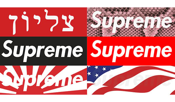
To celebrate the opening of Supreme’s second store in Japan, the brand released a Harajuku exclusive pink snakeskin box logo. This store is a fan favorite in Tokyo, being located in the heart of Tokyo’s fashion district. The store is filled with photography, specifically shots that have been featured on Supreme’s coveted Photo Tees, such as Raekwon & Elmo and Kermit the Frog.
The box logo shirt that came along with the store’s opening is one of the rarest shirts to release. The print is embossed and glossy on the shirt, making this version of the box logo to have texture. On the back of each shirt was the store’s opening date printed, stating “160906”. Despite only having this specific pink colorway of the snakeskin box logo in Japan, red, black, and yellow versions were released at all locations at the time. It is said that the first customer at the store received the iconic pink tee, which is the hardest one to come across these days, being resold for over $2,000!
Los Angeles

Image by Highsnobiety
Known colloquially as the “Hebrew Box Logo” tee, Supreme added this variation of the box logo to their collection when opening their second US brick and mortar on Fairfax Ave in California in 2004. Fairfax, which is known as one of LA’s more popular shopping destinations, was once a bustling Jewish community. The streets used to smell of challah bread and be filled with freshly cut deli meats. Today, many of the people have moved East, but some still own property in the area and serve as landlords to many of the businesses on the strip.
The accompanying box logo shirt pays homage to that Jewish cultural hub. It utilizes Hebrew lettering in white font encased in the famous red box logo. On the back of the shirt, the store’s address “439 N Fairfax Ave, Los Angeles, CA 90036” is printed on the back of the white tee.
Daikanyama

Image by Highsnobiety
Supreme and Japan have a great relationship, seeing as how it is the country home to the most Supreme stores in the world. Daikanyama was their first permanent store in the Land of the Rising Sun, opening up in 1998, only 4 years after Supreme’s inception. The store, compared to the others in the same country, is fairly small. This store is home to many photographic pieces on the walls, but with none of the art statues that we see in other locations.
This box logo design was done in a grid fashion, as if it were being cropped and edited on a Microsoft Word document. It features minimal blue dots on the ends of it, adding to that resizing style. This box logo is also considered a rare item, with resale prices going for as high as $7,000.
Daikanyama Friends & Family

Alongside this tee was another box logo design with no Supreme branding within its rectangular shape. Replacing the text is a picture of a mouth-agape woman within the box with horizontal lines printed across her face. This shirt was given to friends & family of the company only, making it even more of a rarity than its red box logo partner. With little to no Supreme branding in the box logo, the tee resells for a cool $900, still a high number but less than its Box Logo relatives.


