By now the origin story of Nike, the journey of Phil Knight and Blue Ribbon Sports, has circulated through every medium known to man. But the origins of the iconic Nike Swoosh are often unknown, and it shouldn’t be. The Swoosh is the identity of Nike and its creator should be celebrated. So, who designed the Nike Logo?
Carolyn Davidson is the mastermind behind the Nike logo.
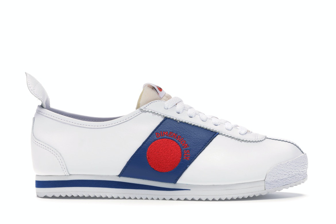
Davidson was hired to design the logo when Phil Knight and Blue Ribbon Sports decided to sever their ties to Onitsuka Tiger and create their own sportswear brand rather than merely importing sneakers that would later be known as ASICS. The story goes that the Nike name did not arrive until the final day that BRS had to let their manufacturer know what name and logos to print on the shoes and shoeboxes. Phil Knight liked the name Dimension 6, but nobody else did (makes sense, that name sucks). Other options were blatant knock-offs of popular running brands, like the name Bengal (just another big cat). Luckily, Blue Ribbon Sports employee Jeff Johnson woke up that morning with the idea to name the new company Nike. He explained Nike is the Greek goddess of victory, which makes perfect sense for shoes geared for competition. While nobody was really in love with it, they all decided it was the best of their options and ran with it.
The story goes that with this inspiration, Carolyn Davidson was tasked with designing a logo that resembled the wings of the Greek goddess Nike. She was compensated with a measly $35 for the 17.5 hours she worked on the design.
This mythological tale has been the story of Nike’s logo since the first Nike shoe released in 1971. But this all-too-familiar story is wrong.
The real story follows an unorthodox timeline and is not as deep as it is made out to be.
The Truth Behind The Nike Logo

Carolyn Davidson’s process sketches of the Nike logo.
It’s true that back in 1971, Knight and Blue Ribbon Sports were in a time crunch to choose a logo and name for their new company, but contrary to popular belief, the Nike logo was not inspired by the Greek goddess Nike’s wings. When Phil Knight hired Carolyn Davidson to design a shoe logo, he requested that her design needed to convey motion and look unique from the logos of competitors (mainly adidas and Puma). Making a static design look and feel fluid is a challenging task and requires time. Although the original story noted that Davidson billed BRS for 17.5 hours of work, she noted in an interview with The Oregonian that she spent more time than that finding the right design. For two to three weeks, Davidson sketched countless designs on tissue paper over a sneaker silhouette. It took her many attempts with trashcans stuffed to the brim with crumpled paper, but in the end, she arrived at six designs that she felt were worthy to present to Knight and the team.
In the spring of 1971, Davidson drove to the Blue Ribbon Sports office in Tigard, Oregon and presented her final designs. From the start, it was clear that the team favored the Swoosh Nike logo. But Knight was skeptical. He preferred the Swoosh over the other options, but he still wasn’t in love with it. With time running out and the factory in need of a side stripe for the first Nike shoes, Knight figured it would grow on him and agreed to go with the Swoosh. For the next few weeks, Blue Ribbon Sports stood as a company with a logo, but no name. BRS wouldn’t become Nike until the unforgettable morning when Jeff Johnson awoke from his dream. With this sequence of events, it is clear that the Nike name and logo weren’t affiliated until that first Nike shoebox was printed.
The Real Cost of the Nike Logo

1972 Nike Moon Shoe / Image by Sothebys
While key components of the known Nike logo story have been misconstrued, the part where Carolyn Davidson only billed $35 for the Nike logo design is shockingly true. It is a preposterously low price tag for one of the most renowned logos in history. You can’t even buy a pair of Nike Air Monarchs for $35, let alone the Nike logo. But in the late 1960s, it was a different time. Knight was working as an assistant accounting professor at Portland State University to supplement what little income he received from his failing Blue Ribbon Sports business, and Davidson was a design student struggling to pay for oil painting classes.
The two crossed paths when Knight overheard Davidson explaining her financial situation to her friend on the PSU campus. Knight was in need of a graphic designer to put together charts and graphs for an upcoming meeting with Onitsuka Tiger, so hearing a graphic design student needing extra money was music to his ears.

Image by First Versions
Knight offered Davidson an opportunity to freelance for Blue Ribbon Sports at a rate of two dollars an hour. In 1969, that was 60% higher than minimum wage. Still, it wasn’t like Davidson was flipping burgers. She was a designer and underpaid for what she was doing. The details of her employment must be understood in the context of gender inequality at that time. In the 1960s and 1970s, the gender pay gap in the US was at its worst point in history with women being paid a mere 58 cents on the dollar compared to men. Wage gaps permeated every industry and sadly, most women, including Davidson, accepted their losses and took what they could get.
Davidson accepted Knight’s offer and freelanced for Blue Ribbon sports for the next couple of years, mainly creating charts, graphs, and some advertisements. When Knight came to her with the project of creating a new company logo in 1971, it was just like any other assignment. She didn’t really think much of it at the time and accepted the same two dollars an hour wage she was used to receiving. To this day, Davidson thinks of the Nike logo as “just another logo she designed for work”, as she explained in an interview with ABC. With that being said, she did not copyright the Nike logo or negotiate for royalties on every sale of products that featured her logo. It was impossible to predict that Nike would become the biggest sportswear brand in the world. Davidson was merely completing a project for a client at a time they both were struggling.
Better Late Than Never

Image by DNA Mag
Almost a decade later, Davidson was given additional compensation for designing the Nike logo. In the early 1980s, Nike grew from fledgling running shoe manufacturer to a sizable public company (although it still was nowhere near what it is today) and was worth a lot more than it was when Davidson worked for them. After becoming Nike’s president in 1983, Bob Woodell approached Phil Knight with the idea of doing something for Davidson. He understood that she was underpaid for her contribution of the Swoosh and that Nike should make it right. Knight agreed and they called Davidson to set up a meeting.
Carolyn Davidson arrived at Nike’s office expecting to meet with Knight and Woodell for lunch, but when she walked in she was surprised by a party thrown just for her. At the party, Woodell offered Davidson a certificate that acknowledged her as the creator of the Nike logo, a gold and diamond Swoosh ring, and 500 shares of Nike stock worth over $8,000 at the time. $8,000 is still low compensation for the logo of a multi-billion dollar company, but Nike wasn’t top dog in 1983. Michael Jordan was still in college and adidas and Converse were still running the game. Davidson’s updated compensation was still less than what she rightfully deserved, but was better than $35.

Image by Motoya Nakamura / The Oregonian
Since Davidson received her shares for the Nike logo, there have been four separate two-for-one stock splits. The estimated value of her shares in Nike today is just over $780,000 (assuming she hasn’t sold) but for Carolyn Davidson, this wasn’t anticipated. Nike becoming what it is today was a one in a million chance. Had Nike failed like most other companies in their position, the Nike logo would have been just a logo and Carolyn Davidson would have been another woman who was underpaid for her work.


