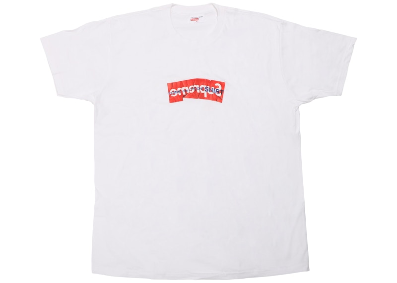
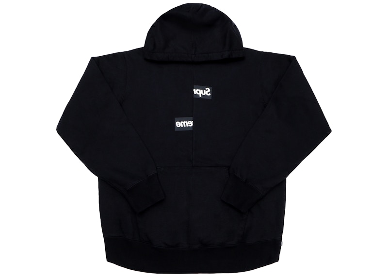
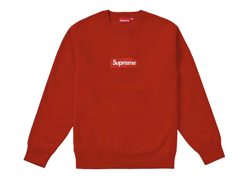
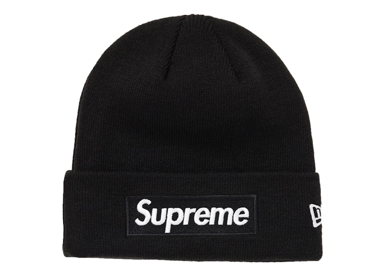
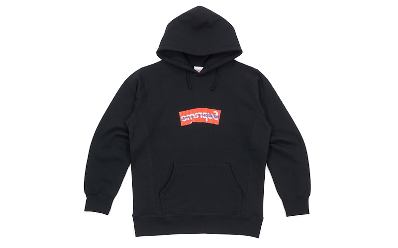
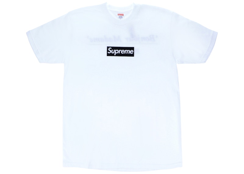
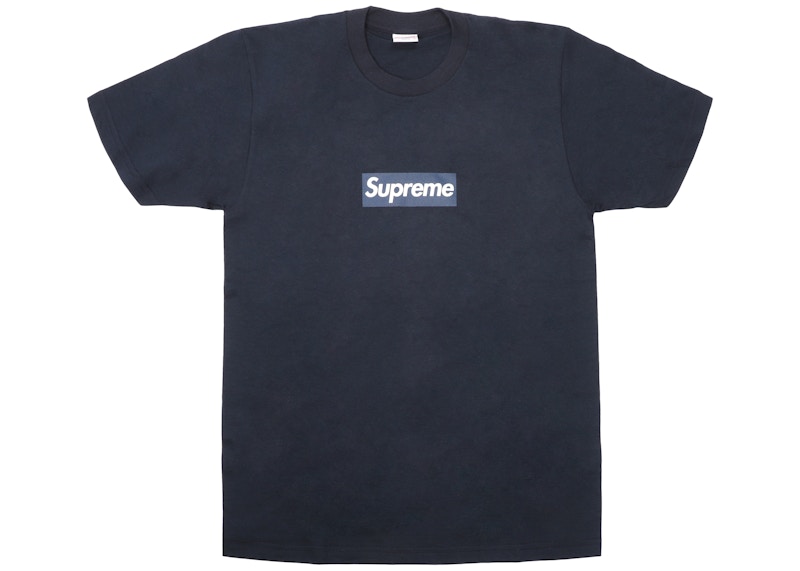
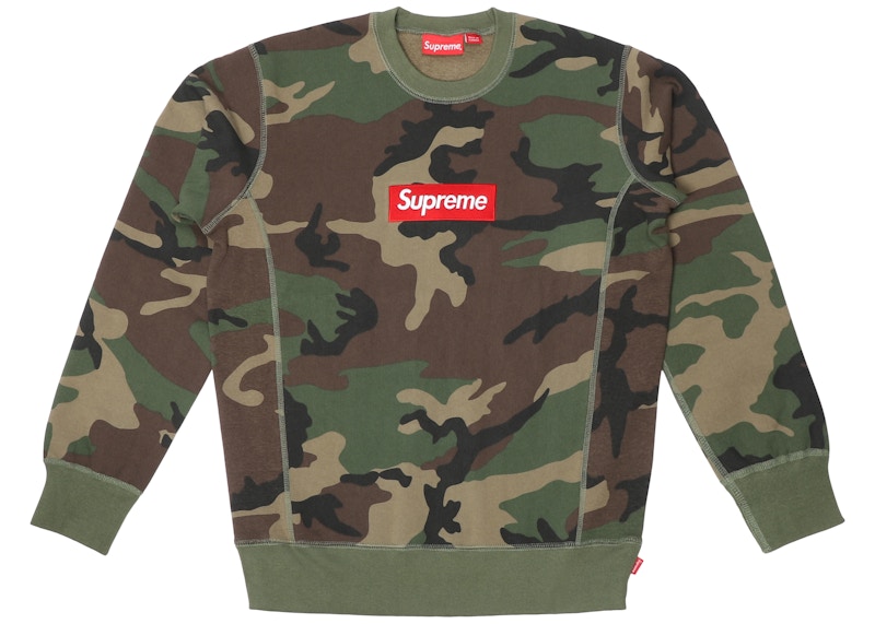
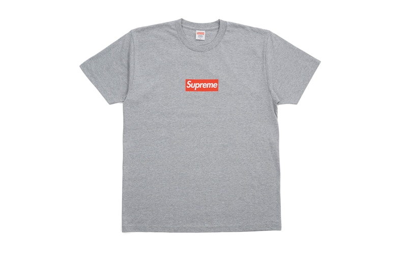
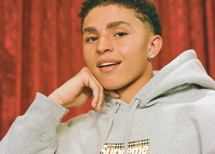
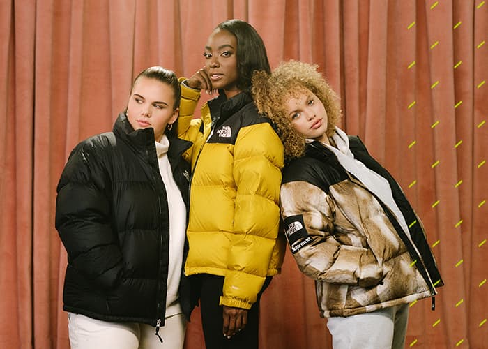
Supreme’s brand recognition in 2019 is undeniable. 25 years after their conception, they’ve collaborated with Louis Vuitton, won a CFDA, and been valued at a billion dollars. Literally anything with the now notorious box logo on it sells out immediately, and resells at an unbelievable premium. And it is nothing more than the word “Supreme” in italicized Futura Oblique font inside a box. The logo has become something of a status symbol. Before Supreme, however, the typeface and art style all together stood for something more than skateboarding and authenticity.
Barbara Kruger attended Parson’s School of Design in the mid-60’s and dropped out before the decade was over. Her departure would not be in vain as she’d go on to do graphic design at Conde Nast until the mid-70s. In 1976, she moved to Los Angeles to teach at UC Berkeley where she began to once again dabble with art. After nearly a decade of professional graphic design, Kruger’s proper art career would come out of that graphic experience. In what would become Kruger’s emblematic style, she began experimenting with collage art, often creating controversial and timely graphic imagery. In a 1981 art show titled “Public Address”, Kruger debuted white Futura text in a red box over a black and white image for the very first time.

‘I Shop Therefore I Am’ by Barbara Kruger
She’s carried that style throughout most of her artwork to this day. In 1987, her most popular piece “I Shop Therefore I Am” would be released. The piece is a twisting of the famous Descartes quote “I think therefore I am”. The artwork is meant to shift the way its observers think about materialism. Not long after releasing “I Shop Therefore I Am”, Kruger released another popular piece titled “Your body is a battleground”. Presented in the same, now emblematic style, “Your Body Is A Battleground” was released with a more political message than its popular predecessor. Released in support of a feminist movement supporting women’s rights, the artwork was considered by some to be propaganda.
Since the release of those two pieces in the late 80’s, Kruger’s career has been nothing short of staggering. She’s sat on the board at MOCA (The Museum of Contemporary Art) for multiple years and held exhibits at the MOMA (Museum of Modern Art) and Hirshhorn Museum in DC. Her ethos has changed very little, still calling out social injustice in regards to women and mocking the culture of consumerism. In 2005, Kruger was awarded the “Golden Lion” Lifetime Achievement Award at the 51st Venice Biennale. Today she spends her time between Los Angeles and New York, teaching as a professor at UC-Davis and creating public installations.

‘Your Body Is A Battleground’ by Barbara Kruger
Her relationship with Supreme is as interesting as her career. One would think she’d be upset with them ripping her design ethos and even more directly, some of her prints. In reality, Kruger is less than bothered. Her response when she’s asked about Supreme using the art style is downright dismissive: “I don’t own a font”, she tells The Cut. Her idea of intellectual property is relatively loose. She considers it “a euphemism for corporate control” as stated in an interview with Interview Magazine. Contextually, this makes her the perfect artist to emulate for Supreme, a brand well known for ripping designs and making them their own.

‘Your Manias Become Science’ by Barbara Kruger
In 1994, as Supreme started, they began to work on a namesake brand for their store. Early on, they primarily sold other brands’ gear but as they started working on a namesake brand, they needed a proper logo. According to Highsnobiety’s “Here’s Everything You Need to Know About the Supreme Box Logo”, James Jebbia lent a book on Kruger to his graphic designer to help them create the logo. Whether or not the logo was a direct lift or was inspired by it is somewhat beside the point, though; after all, Barbara Kruger doesn’t even acknowledge the art style as hers.

‘You Construct Intricate Rituals Which Allow You To Touch The Skin Of Other Men’ by Barbara Kruger
Taken in context, Kruger’s attitude on the subject presents a different level of irony to Supreme’s ethos and message. Kruger’s most popular work “I shop therefore I am” is antithetical to what Supreme is today. One stands as a criticism of consumption as a whole, the other has become a symbol of said consumption. It’s also ironic in that while Kruger had no quarrel with Supreme’s similar art style, Supreme has come to legal battles with another company over the use of a similar style. In 2013, streetwear brand Married To The Mob notoriously produced various apparel items featuring the words “Supreme Bitch” in a similar art style. Supreme’s response was a $10 Million USD lawsuit. Complex reached out to Kruger and, in what was her first public statement on the brand, she replied in only three sentences. “What a ridiculous clusterfuck of totally uncool jokers. I make my work about this kind of sadly foolish farce. I’m waiting for all of them to sue me for copyright infringement.” In 2017, with the New Yorker, she’d comment again: “I thought it was so amusing. Here are these people, so cool—like, you know, totally rad, out of the bubble—and there they are suing each other on the most conventional, proprietary, monetary level”.
The irony doesn’t end in Kruger’s final sentence, “I’m waiting for all of them to sue me for copyright infringement”, either. During the fall of 2017 (or FW17 if that’s the only way you can read seasons at this point) Barbara Kruger installed 5 new exhibits as a part of the season’s Performa Biennial. The exhibits featured a billboard, school bus, and more in reference to Supreme, a skate park. In her emblematic style, red stickers featuring white Futura font are placed pompously throughout the park. Featuring wording like “Who Owns What?”, the installation seemed a clear shot at the skateboarding brand.

Still of Barbara Kruger’s Commission at Performa Photo: Paula Court
Amongst the exhibits was another that seemed to hit at the brand: a pop-up shop called “Untitled (The Drop)”. The store formed a line around the corner of the building and inside, skateboard decks, beanies, and tees featuring white and red Futura graphics. When asked for comment by The New Yorker, her answer was interesting and somewhat elusive. “The whole idea of streetwear being branded and corporatized is only something that’s emerged with this sort of power over the past fifteen to eighteen years,” she said. “I think it’s sort of interesting, and it’s very complicated but compelling, that my work and ideas and visuality have been drawn into so many sites of communication”.
Today, Supreme is famous for their collaborations, but in the past, what is considered to be a collaboration today would’ve been a logo rip in the past. Just look at Louis Vuitton. Supreme has been the target of numerous cease and desist orders, especially during the early days. Famously, Louis Vuitton levied a cease and desist against Supreme over a monogram box logo in 2000 (running theme of this writing is irony if you couldn’t tell). Yet in 2017, the two companies worked together. Kruger’s particularly loose stance on intellectual property and all around ironic nature, in a way, makes her the perfect artist for Supreme to lift their logo from. One could make the argument that the two, in reality, aren’t all that different after all. Instead, they’re like two distant relatives, simply serving their purposes, independent of each other.
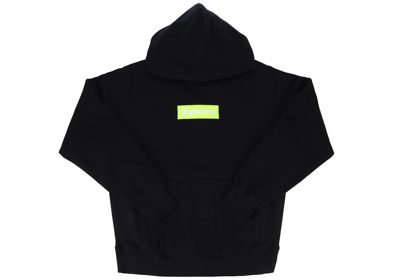
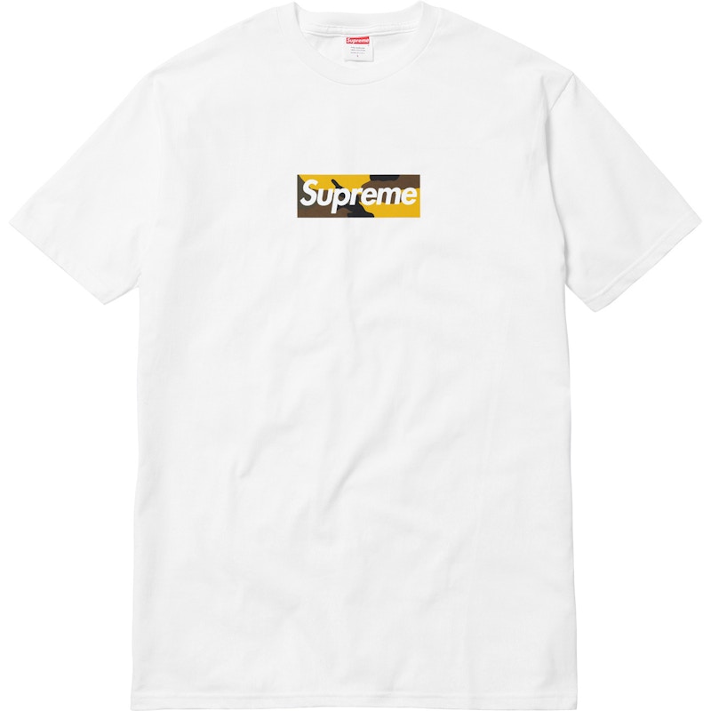
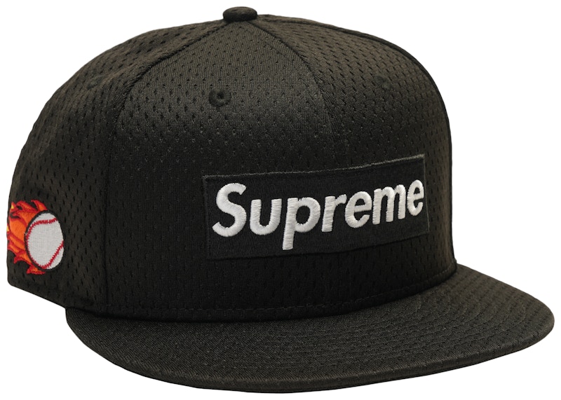
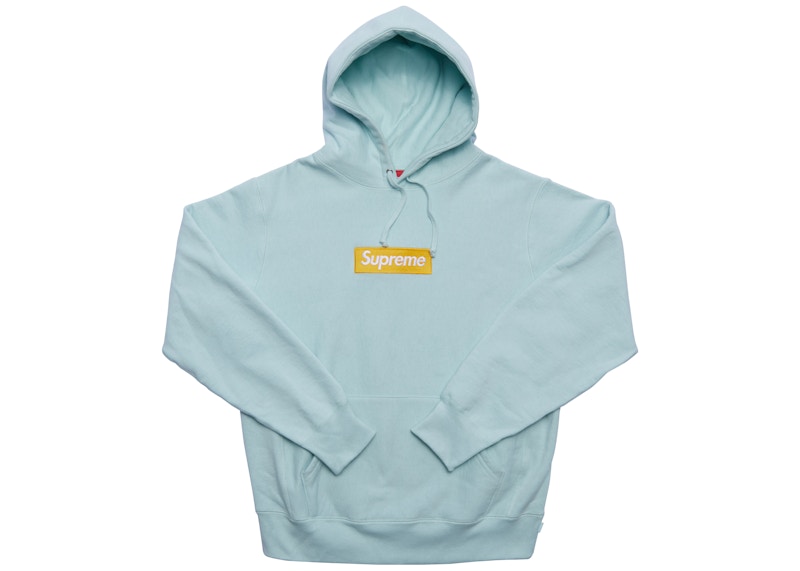
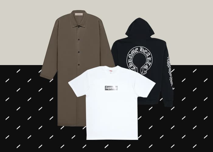
Shop Supreme Box Logo tees, hoodies, crewnecks, and beanies on StockX here or below.


