BACKGROUND
The Nike Zoom Vapor 9 Tour is a signature model tennis shoe designed by Tinker Hatfield for Roger Federer.
This is the Nike Zoom Vapor 9 Tour Agassi.
It was released in November 2012. It was a general release. Retail price was $130. It is awesome. I bought a pair and wear it all the time. It is my 12th favorite sneaker; that was not easy to determine. We do not track it on Campless. That’s because in two years there have only been 41 sales on eBay, at an average price of $125. But it wasn’t a particularly limited sneaker. It’s just that people bought it to wear. Not sell.
This is the Nike Zoom Vapor 9 LE Savile Row.
It was released in November of 2013. It was a limited edition. Retail was $160. It is also awesome. I do not own a pair, but wish I did. We do track it on Campless (profile here). It has an average price of $220, based on 114 DS pairs sold in the past 12 months. Pairs on eBay are listed for as much as $350.
This the Nike Zoom Vapor 9 RF 287.
It was released in July of 2012. There were only 287 made, in honor of 287 weeks Roger Federer spent as number one. Retail was $287. We track it on Campless (profile here). Average resell price is $1,596, with pairs on eBay listed for as much as $5,000. I don’t own a pair but my brother had it in his cart and I told him, “Eh, do you really want to spend $287?” I am stupid. I am required to ask my brother’s forgiveness once a week for 287 weeks. I am sorry, Matt. Please forgive me.
This is the Nike Zoom Vapor 9 AJ3 White Cement.
It was released on August 26, 2014. It was a hyperstrike which dropped only days after it’s first announcement. It released the day after Roger Federer wore the shoe at this year’s U.S. Open; with Michael Jordan sitting court-side. It retailed for $200. I purchased a pair at retail. My brother also purchased a pair at retail. There were many mixed feelings about this shoe before it dropped, including sneakerhead Godfather Russ Bengston claiming “no need for this” and industry stalwart Todd Krevanchi taking 350 words to explain why he would never buy a pair. In the days following release it quickly became apparent how rare these shoes were. Over the next few months 525 pairs were sold on eBay at an average price of $451. Forty-five of those pairs sold for at least $600, with four reaching for at least $800. Pairs on eBay are listed for as much as $1000; according to our data, one pair actually sold for that amount. Neither my brother nor I are selling. We obviously track it on Campless (profile here).
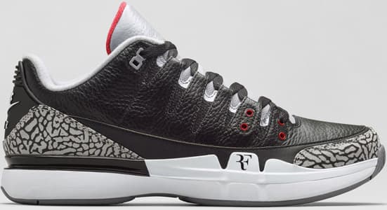
This is the Nike Zoom Vapor 9 AJ3 Black Cement.
It was released on November 10, 2014. It was a hyperstrike which dropped only days after it’s first announcement. Federer also wore this colorway during the 2014 U.S. Open. It also retailed for $200. My brother and I tried desperately to purchase a pair, but failed miserably. There were no mixed feelings about this release. Resellers openly bragged on Twitter about how much money they were going to make. The cost of ATC slots soared. And the NikeLab NYC release was cancelled because some idiot pulled out a gun in the hopes of scaring people to give up their spot in line. In the first five days following its release, 140 pairs were sold on eBay at an average price of $580. We do not yet track it on Campless, but we will add it soon. Pairs are flooding eBay, with some being listed for as much as $1000, although most are much lower.
Now that we all know a little bit more about the Nike Zoom Vapor 9 (and my personal connection to it), we can commence with the analysis.
INTRO
Five Vapor 9s, five very different stories. Even between the two AJ3s, the differences are significant. But why?
That question has been at the heart of almost two weeks of sneakerhead social chatter. People are still selling Black Vapors; others are still complaining about how expensive they are. The argument over what the shoe is “really worth” is almost as persistent as the angst towards those who “never liked tennis shoes to begin with”. And if we needed tangible proof of the magnitude of the situation, Sn’eads by Ree confirmed it by immortalizing the moment.
With the topic of the day quickly becoming the topic of the month, we decided to take a deep-dive into the Vapor 9 AJ3 data and see what we can learn.
Hypothesis: The high price of the Black Vapor AJ3 can be attributed to the perception that the White Vapor AJ3 sells for more than it actually does.
Data: All data for this analysis was pulled on November 15, 2014, five days after the release of the Black. All data is from eBay listings for DS pairs of the White and Black Vapor AJ3.
Methodology: For a perception analysis we will rely on many of the same methods we used during the analysis documented in “eBay Prices are a lot better than you think“. Usually we present our findings with one or two summary charts. For this analysis we are going to use many charts, taking you through our thought process, one step at a time.
ANALYSIS
The best way to start is by simply comparing the average resell price of the White and Black. The following is the average price of both pairs, based on all pairs sold as of November 15.
Insight: As a starting point, the Black is selling for 29% more than the White.
Issue: There are many nuances not addressed here. Most obviously, we know the Black has only been out five days, and the White three months.
Next Step: Let’s compare sales of the White after five days to the Black after five days.
Insight: In a more “apples-to-apples” comparison – now using the same relative sales period – we can see the Black is significantly more expensive than the White. Previously, it looked like the Black was selling for 29% more, but now we can see that it sold for 46% more during the same five-day, post-release period.
Issue: We are still missing important detail about the White. We calculated average price for two time periods (total and 5 days post launch) but don’t how much it sold for the rest of the time.
Next Step: Compare all relevant time periods for the White.
Insight: With all three time periods graphed we can see that the average price of the White took a big jump (30%) after the initial 5 days, selling for $518 thereafter.
Issue: $518 is still pretty far from $580, so we don’t yet have a good explanation for why the Black is selling for $580.
Next Step: Recall that our hypothesis is focused on perception of the White price. To fully analyze perception we will need to incorporate unsold auctions (eBay listings which end without a sale).
Insight: Unsold listings are priced considerably greater than sold auctions (most of the time), which make sense, logically, why they wouldn’t end with a sale.
Issue: We still don’t have enough information to begin calculating perception. Perception is about how often we see something. We have the “something” – the average price for each shoe/time period – but we don’t yet know how many “somethings” there are, or how often each was seen.
Next Step: Calculate the total number of sold and unsold listings for each shoe/time period so that we can start to understand how many shoes are being listed at which prices.
Insight: In what has become a very busy chart we can now see the volume numbers (in pie chart) of each of the associated prices. For example, in the first five days there were 289 pairs of White sold at an average price of $397. During the Blacks’s first five days, there were 140 pairs sold at an average of $580. No obvious insights jump out from across the White time periods, but its worth noting that the Black had a very poor sales rate during it initial 5 days – only 45% – compared to White’s 72% during that same time period. This may be evidence that the Black is overpriced, or perhaps the White was initially underpriced.
Issue: Number of eBay listings (sold and unsold) is helpful for understanding how often certain price points show up on eBay, but it is only part of the equation. At some point we will need to explore how long each of these listings remained on eBay. But we have another problem here, as well. The White time buckets – which were created to compare against the Blacks’ 5-day sales window – may not have enough granularity to provide good insight when we do the perception analysis. The “Post 5 Days” bucket is very long – 11.5 weeks – and personal experience tells us that the price has jumped around a lot on eBay.
Next Step: Look at sales of the White by week, over the full 12 week period.
Insight: Wow. Many new insights by looking at White sales by week. Here are some:
- 78% of all White sales took place during the first two weeks, when prices were still low. This explains why the average price is only $451, even though the price has been greater than $451 for 11 of the 12 weeks. This is a HUGE issue for understanding the average price of all sneakers on Campless, not just the Vapor 9 AJ3. Here it foreshadows a big perception issue which will come into play later.
- From Week 3 to Week 10 the average price was very stable at $564. It never went above $600 or below $527.
- Finally, we see a huge price increase ($114 or 20%) following the announcement of the Black. We also see a slight uptick in the number of White pairs sold after the Black announcement – from 6 in the two weeks prior, to 11 in the two week after. We don’t yet know enough to determine if there is causation here, or just correlation.
Issue: Lots of valuable insights, but the chart is very busy and doesn’t show the Black. This makes it hard to discern any comparative insights between the two.
Next Step: Let’s take a simpler view of the same data and plot next to the Black.
Insight: You’ll recognize this view – it’s the same as earlier – only now we have different (more relevant) time buckets for the White. We can see the factors which may be contributing to the White’s change in price over the 12 weeks, but any guess as to why the Black came out of the gate at $580 would still just be a guess.
Issue: This view is very helpful, but is still missing necessary elements to analyze perception.
Next Step: Rather than add unsold prices to this chart, let’s go back to the White weekly view and look at unsold there. The perception analysis will focus on the White, so its OK to leave the Black off the chart to start.
Insight: If perception is a function of what is seen on eBay, it’s easy to understand why people think the average price of the White is so much higher than it actually is. Look at all that action above the red line!
Issue: This chart is very helpful to explain the logic behind the perception issue, but we can’t actually calculate the perceived price unless we know how many long each auction has been on eBay.
Next Step: A chart showing how long listings stay on eBay, by price.
Insight: Now we’re talking. The X-axis is number of days the auction was open. The Y-axis is still average price. And we’re still looking at both sold and unsold auctions.
- Not surprisingly, auctions which disappear quickly are those priced below average. Good deals are snapped up quickly. This makes perfect sense.
- The longer an auction sits, the more likely it is to be very expensive. This also makes perfect sense, as no one is going to buy something priced too high. It will sit for a long time.
- If you are looking at an auction which has been sitting for 3 days or more, chances are that its overpriced.
Issue: This chart does not have number of auctions, or total number of days seen, which would allow us to quantify perception.
Next Step: Calculate total days seen by adding the number of days open for each listing (individually) and then segment them by price bucket.
Insight: Almost half (44%) of all days that the White has been on eBay was at a listing priced of $600 or more, but we know that only 45 of 525 (8.5%) actually sold for greater than $600. Wow! This really helps explain why people think the White is selling for so much. Keep in mind that when someone looks at a live eBay auction they don’t know if it’s going to end in a sale or not – they just see a listing. Listings are what creates perception.
Issue: We could take the numbers on this chart and calculate an aggregate average price based on number of days on eBay, but we would be doing so based on price ranges. That would not be precise. Fortunately, we have the ability to do that calculation on a listing by listing basis, and calculate Perception Price more accurately.
Next Step: Calculate Average Price per Days Open and equations required to determine Perception Price.
Insight: There you have it. Perception Price of the Vapor 9 AJ3 White Cement is $610. Recall that actual price is $451.
Issue: We need to check our work; we need to confirm that $610 makes sense given the rest of our work
Next Step: Plot Perception Price on some of the earlier White charts showing actual average price.
Insight: We’ve plotted the Perception Price on two of our earlier charts so you can see how it “feels right” on both. Unfortunately, it’s not the actual price. But when trying to determine why the Black is priced the way its priced, the actual price of the White is irrelevant. What’s important is what people think the price is. And we’ve just proven they think the price is $610.
Issue: If Perception Price of the White is $610, why is average price of the Black $580? Is this close enough or are we missing something?
Next Step: We are missing something. We are missing the final step where we calculate the actual listing price for the Black (total sold and unsold), and see how close that is to the White.
FINAL INSIGHTS
It took a while to get here, but the results are pretty remarkable. When we start these things, we never know what the outcome will be. We had a hunch that something was wrong. There was no reason to believe that the Black Vapor AJ3 would be inherently more expensive that the White. For the actual Air Jordan 3 Retro, the average price of the Black (2011) is currently $292, while the White (2011) is $277. That’s a difference of just 5% while the Black Vapor sells for 29% more than the White.
We built on that hunch and created a hypothesis that the Black is being priced so much greater than the White due to a perception that the White is selling for more than it actually is. That hypothesis was based on experience, knowledge and previous work. Our experience analyzing the perceived price of Air Jordans in “eBay Prices are a lot better than you think” gave us the knowledge that perception is often higher than reality, but there was no guarantee that the Black would be priced so closely to the White perceived price. That was just cool.
The truly amazing thing here is how this plays out in real life; how resellers “learn” to do this. We are pretty darn positive that not one reseller, and certainly not any aggregate group of resellers, knew that they perceived the White to be selling for $610. Certainly no one conducted the above perception analysis to determine how to price the Black. Each reseller acted independently, using his or her experience and knowledge and previous work to set a price that they thought was best at the given time. Their goal was to maximize profit while selling quickly. That collective sub-conscious experience and knowledge and previous work came together and, as a market, priced the Black where it “felt right” – and this despite the fact that only 36 of the 525 actual sales for the White (7%) were greater than $610.
This analysis is fascinating (at least to us), but it doesn’t mean that resellers are pricing “right” or “wrong” (for Black or White). Like with any limited shoe, the seller usually holds the power. And like pretty much every shoe we track at Campless, the farther you get from release date, fewer pairs are available, so prices increase. And no matter how many pairs have been sold for what price, any single transaction is always going to be the meeting of two minds, and that’s it.
But at least now we know why the Black has been selling for so much more than the White.
What do you think? Were you able to follow our analysis? Are there any steps you would have done differently?
——————
Don’t forget to take the Sneakerhead Survey and contribute to a better understanding of our community. Initial results here.


