

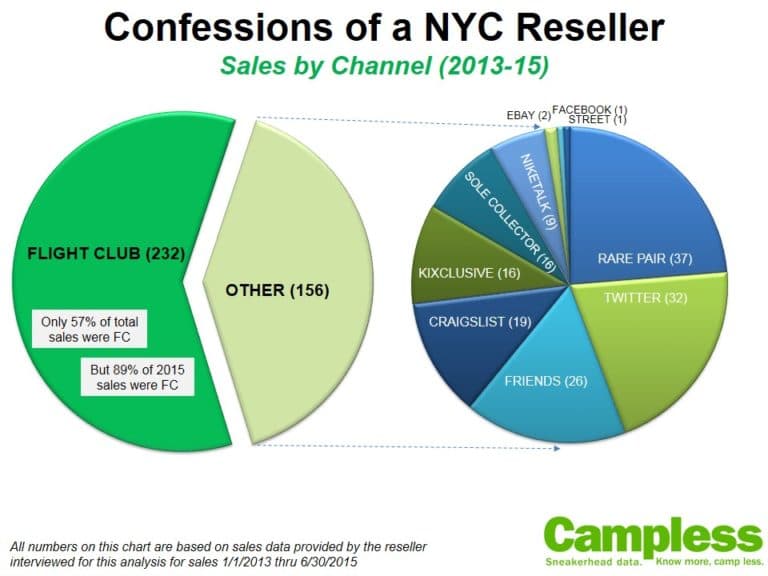
BIG CAVEAT: The following analysis is based on the 1,311 sneakers that Campless tracked during 2014. If you are an eBay seller and sold any shoe which is not on this list, those sales are NOT included in this analysis. For a full list of these 1,311 sneakers, see Campless homepage.
—————–
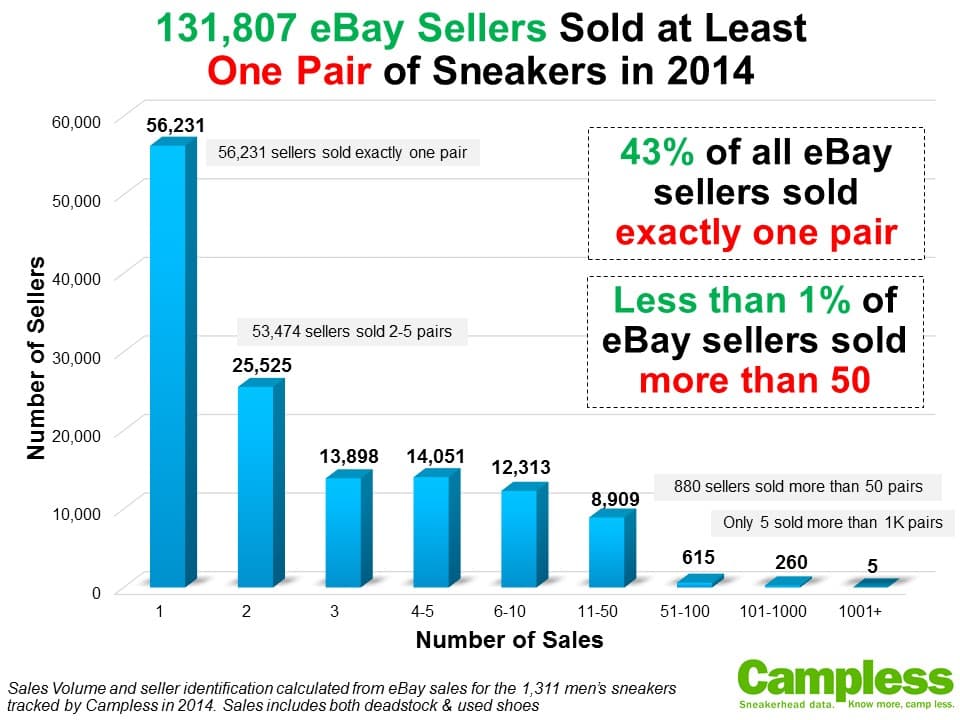
In 2014 there were 131,807 sellers who sold at least one pair of “sneakerhead” sneakers – those tracked by Campless. Think about that for a second. One hundred thirty one thousand. Granted, there may be people with multiple accounts, and yes 43% of these sellers sold exactly one pair, but holy crap – that’s a lot of people flipping kicks on eBay. These 131k sellers accounted for $143 million in total sales. And if you’ve seen any of our previous work around size of market you might recall that total eBay sales in 2014 was $343 million. If the number of sellers increases proportionately with income (which is probably doesn’t) this means there could be as many as 314k total sellers. Damn.
With so many sellers and sales to wade though, we’re going to use that as the excuse for why we’re publishing our 2014 eBay seller analysis in March…so here goes:
Let’s start with a deeper look at the 131k sellers and how many pairs each sold:

Key Insights:
- The big call-outs say it all: 43% of all sellers sold only one pair, while less than 1% (.67% to be exact) sold more than 50. Fragmentation, anyone?
- When you think about how fragmented the rest of the market is, trying to get a handle on the resell landscape is even more overwhelming.
So who’s leading the way?
Here are the Top 25 sellers by total dollars and, as an added bonus, how their pricing compares to the market average:
Key Insights:
- For the second consecutive analysis, solesupremacysales lands at number 1 overall and thecoolshoeshine comes in second. The last time we did this was February 2014, which you can see here.
- The disparity between the top two sellers and the rest of the pack is comical: The total dollars sold by the top two ($4.5M) is greater than the combined sales of numbers 3-25 ($4.1M).
- But the disparity between #1 and #2 is also noteworthy: solesupremacysales had sales of $2.71 million which is almost one million dollars more than thecoolshoeshine!! To put this in larger context, the average Foot Locker store does $2 million a year* – that’s 26% less than solesupremacysales!!
*Estimated by Campless using Foot Locker 3Q’14 earnings report and number of stores.
Note: “Price Deviation from Average” is a measure of pricing – high prices vs. low prices. The greater the deviation percentage (positive) indicates that the seller’s pricing is greater than market average. The lower the deviation percentage (negative) indicates pricing below market average. Average price and therefore price deviation was calculated from a control group of 120 sneakers which had at least 1000 sales in 2014 (deadstock and used), although we only included deadstock sales in the price analysis. A full list of these 120 sneakers can be found in the APPENDIX at the end of this post.
Another way to look at the same group of top sellers is to rank them by price deviation:

Key Insights:
- The most obvious insight from this is that only three of the top 25 sellers have pricing less than market. This isn’t a bad thing, though. In fact, it makes perfect sense when you consider that 1) we’ve conducted analysis which shows that eBay sellers with more feedback command higher prices*; and 2) the top sellers are less likely to be selling fakes**.
- As can also be derived from the previous chart, the top two sellers have taken significantly different routes to their massive sales: solesupremacysales (#1 in total sales) is the lowest priced seller at 18% less than average, while thecoolshoeshine (#2) is one of the more expensive sellers, at 13.3% greater than average.
*Note 1: We are currently working on an update this analysis which will be significantly more comprehensive (120 sneakers vs. 3 sneakers) but the findings are the same.
**Note 2: In the interest of full transparency, the seller “monsterhighscustoms03” was suspected and accused of selling fakes by a Campless reader. See the comments section of this blog post for the full discussion, including comments from the seller, and make the decision for yourself.
So what shoes are the top 25 sellers moving? Exactly what you think:

Key Insights:
- The obvious standout on this list is the Yeezy 2 Red October. While at least 145 pairs were sold of each of the other 14 shoes, there were only 17 pairs of the Red October sold in 2014 by these 25 sellers. But at an average sales price of almost $3900, it obviously makes sense that it would place on a ranking of total dollars.
- When you compare this list to the Campless 2014 Total Dollars ranking, there are actually a few differences. The following six sneakers were in the top 15 overall but didn’t make the cut here: Jordan 11 Legend Blue (ranked #5 overall), Jordan 6 Black Infared (8), Jordan 11 Low Infared (9), Jordan 6 Infrared 23 (11), Jordan 14 Ferrari (12), and Jordan 11 Cool Grey (15). Replacing them on this list are: Jordan 3 Black Cement, Jordan 3 True Blue, Jordan 13 Flint, Yeezy 2 Red October, Jordan 4 White Cement and Foamposite Pro Yeezy. This seems to imply that the top sellers go deeper on classics – for which they can surely charge a premium – instead of over-focusing on the latest releases, where price competition is more fierce.
No real surprises here, but when we look at these sneakers it makes us wonder if anyone focuses on just true heat. Everyone has a different definition of “true heat” – and of course our definition will be data-driven – so we’re going to peg it at $500:

Key Insights:
- Unlike the previous charts, this is not limited to the top 25 sellers, but is a selection from all 131k.
- Both charts show the same data: number of $500+ sales and percentage of total sales which are $500 or greater. The difference is that the top chart ranks the top 15 sales, while the bottom chart ranks the top 15 by percentage.
- Not surprisingly, the top 2 sellers overall (solesupremacysales and thecoolshoeshine) are numbers 1 and 2 for total $500+ sales. However, it’s very interesting to see that while solesupremacysales had 13,973 total sales, only 85 were $500 or more. On the other hand, thecoolshoeshine had more than 5 times as many such sales (452), even though it had less than half the number of total sales (5,359).
- On a percentage basis, even though thecoolshoeshine had 452 big sales, it still didn’t crack the top 15 list. Amazingly, 23isallme had only 82 total sales, but 45 of them were for $500 or more.
We’ve got two charts left – one is very simple and one is quite complex. Which do you want first?
[silence]
Sounds like “simples” have it:

Key Insights:
- There’s not a whole lot of insight here – we just wanted to use the map feature in our charts package.
- Resell volume mirrors population. Makes sense.
- Differences in resell price is likely random based on where particular sellers happen to live, although it might be telling that Maine has the highest prices when you consider that shipping fees are including in our overall sales numbers. Maybe those guys are building in a larger buffer to account for living on the far edge of our country.
And that leaves us with the most complex of them all: 2014 release percentage vs. deadstock percentage.

Key Insights:
- This chart is not actually as complex as it looks.
- Across the X-axis is the percentage of a sellers total sales which were deadstock. For example, a seller who had 10 total sales, 6 of which were DS, would be at 60%. Down the Y-axis is the percentage of a sellers’ total sales which were 2014 releases. For example, a seller who had 10 total sales, 9 of which were released in 2014, would be at 90%.
- Each one of the 131,807 sellers is plotted on this chart based on their two percentages.
- The size of the bubble represents number of sales. Several of the largest sellers are circled in the lower left quadrant of the chart.
- Look for clustering of sellers, as explained in the call-outs on the chart, for insight into typical selling behavior.
And that’s it. Seven separate analyses about the eBay sneaker sellers in 2014.
What do you think? What other analysis would you like to see us perform? What other data would you like to know about eBay sellers?
——————
THANKS: A huge shout-out and thank you to Kurt Wiebell (@KurtWiebs) for all of his help analyzing this data and building charts.
——————-
APPENDIX:
A few additional notes about process:
1. All analyses excluded the eBay seller: “auctioncause”, as this was the seller account for the Boxtrolls promotion. They ended with 660 sales for a total of $343,588 (average $521), but were obviously all one shoe.
2. As mentioned above, average price and therefore price deviation was calculated from a control group of sneakers. The list of 120 shoes was every pair which had at least 1000 sales in 2014 (deadstock and used), although we only included deadstock sales in the price analysis. Here are those shoes:


