

Let me be honest right off the bat, Hublot as a brand isn’t exactly in my wheelhouse. I’ve been around watches for many years now, and can rattle off reference numbers and caliber factoids with ease and enjoyment, but when this Hublot was set in front of me, I had next to nothing to say about it (nothing nice, at least). In the spirit of honesty, I’ve been called out for being a bit on the snobby side when it comes to this hobby (see above), and wearing a Hublot around for a number of days felt like a perfect way to broaden my horizons and welcome some diversity to my wrist. So, on went the Big Bang King, here’s what it’s like to live with.
Before we get to the watch, let’s take a brief look at the brand. Hublot is a relatively new brand by horological standards, but that hasn’t stopped them from making an indelible mark on the industry in their short time on the scene. The brand is the brainchild of a man named Carlo Crocco, who affixed a porthole shaped case (Hublot is french for porthole) constructed of precious metal, to a rubber strap and introduced it to the world in 1980. The unusual combination launched the “Art of Fusion” theme that the brand embraces to this day.

Hublot Advert from the 1980s
The “Fusion” references not only the mixture of materials both high end and low end, but also the literal fusion of steel implanted within natural rubber in order to create a reliable connection between watch and strap. Today, this theme plays out in far more exotic ways, usually involving carbon and or ceramic. While the brand did find some initial success, it wasn’t until Crocco, looking to dedicate more of his time to the Hand-In-Hand foundation, appointed none other than Jean-Claude Biver to helm the brand as its CEO in 2004.
Biver himself is a subject for another day, but his work in resurrecting Blancpain in the 90’s and subsequent appointment within the Swatch Group as Omega’s president made him the perfect candidate to realize the potential of a young brand like Hublot. It didn’t take long for Biver to find his footing, introducing the Big Bang in 2005, a watch that would go on to be recognized for its design at that years’ Grand Prix d’Horlogerie de Genève. The Big Bang is a watch that paved the way for the brand’s massive global presence in the form of partnerships and marketing campaigns that would position the brand alongside the biggest names and events in sports and entertainment.

Original Big Bang from 2005
Today, there are countless variations of the Big Bang, having manifested itself in all manner of sizes, material construction and complications. One thing they have never been accused of being is subtle, or even original. The design has been compared to the Audemars Piguet Royal Oak Offshore family (which was introduced in 1993) more than once along the way. The comparison has never seemed to bother Biver, who insists the porthole design itself is unique to more than one watch, and that there’s nothing wrong with that. I’ve always found the design unique enough from AP watches for other reasons, mainly their size, construction, and dial design.
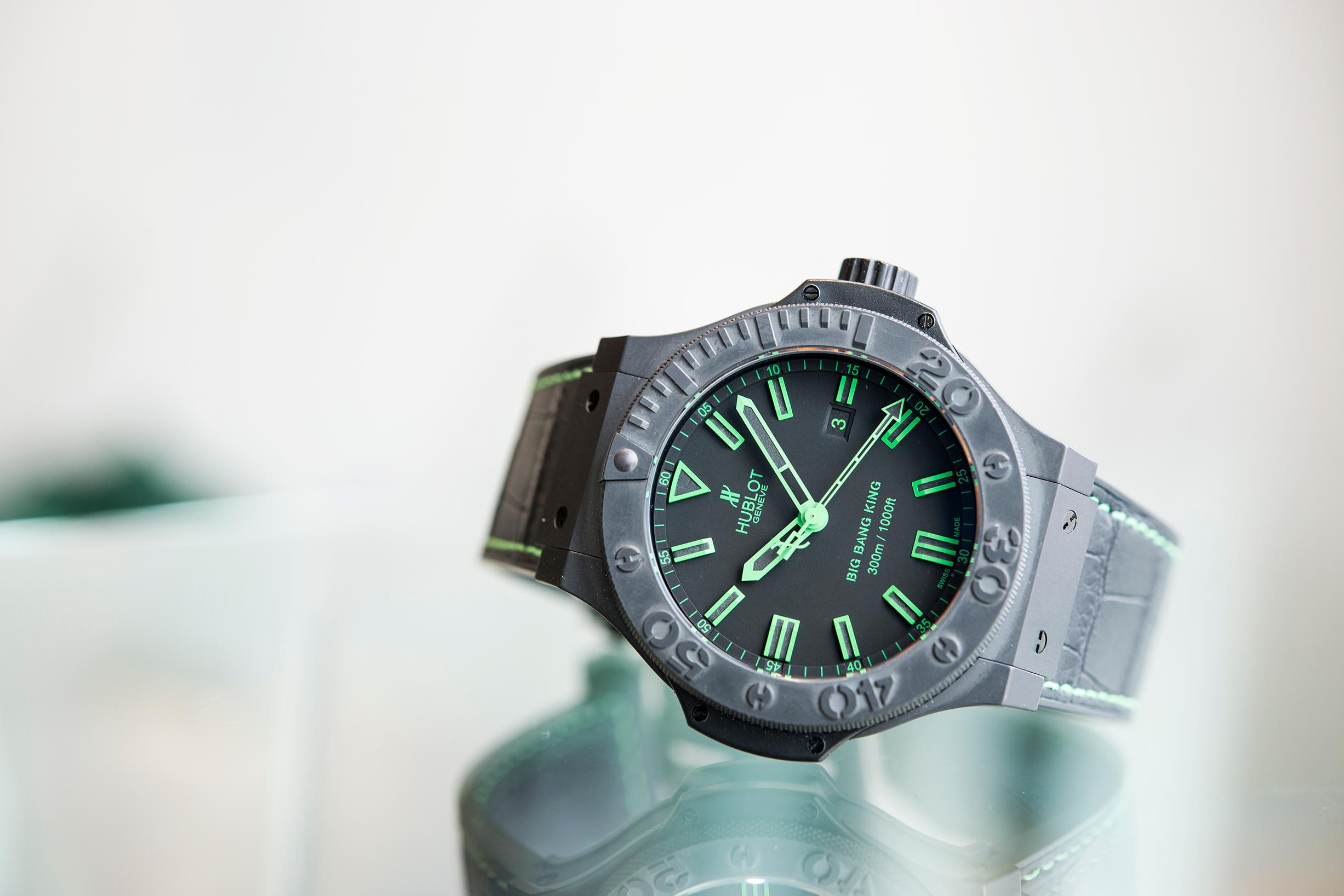
The All Black Green Big Bang King
That brings us to the watch at hand, the All Black Green Big Bang King, a watch introduced in 2011 which represents a time and date expression of the Big Bang, and exemplifies many of the qualities associated with the eponymous collection from Hublot. For better or worse.

Objectively, the All Black Green Big Bang King (ABGBBK?) is an impressive example of the Art of Fusion concept, especially considering its era, being a product from 2011. The case is constructed entirely of ceramic, as is the bezel, which is attached to a black rubber strap with alligator texture imprinted on the top side. It is, as the name suggests, literally all black, save for the selective and welcome addition of green on the dial and strap.

The dial is, like the rest of the watch, black, but hosts the intense green which fill out the practical elements of the watch in the hour and minute markers, hands and date. The intense contrast adds a level of practicality to the watch, making for quick and easy legibility. The hour markers are applied batons with green outlines, and likewise the hands are outlined in green with a stepped seconds hand featuring the Hublot “H” at its counter. Each of these elements are luminescent, making for high and clear visibility in the dark.

Moving to the case and bezel, we’re met with a multi-piece construction, with two plates sandwiching an inset midsection. There are overhangs at 3 and 9 o’clock, with exposed pillars securing the top and bottom. The lugs house the strap integration pieces, with two exposed screws that may or may not be holding anything in place (there are horizontal screws between the lugs on the case). The bezel does rotate, and features first-fifteen minute demarcations, but all the information you’d find on the black bezel is also black, making its use less than practical. If I may go Doug DeMuro for a moment, a quirk of the bezel are the screw heads, which rotate with the bezel, and are obviously not serving any purpose. It’s weird, but it keeps the spirit of the porthole design in tact.

Screw heads on the bezel, for aesthetic purposes only.
Let’s call the case …robust; it measures 48mm in diameter, and 17mm in thickness. Those are some serious numbers, and unfortunately there is not much curvature to the case to help with wearability. I’d make the comparison to Linde Werdelin, who also make multi-piece cases in robust sizes on rubber straps, but they have a curvature to them allowing them to form to the wrist, something the ABGBBK would greatly benefit from. The rubber strap is firm but soft, and should break in to provide some level of comfort for everyday wear.

Inside the ABGBBK beats the HUB1400 caliber, which is based on the ETA 2892. This may lack the glamour that comes with an in-house unit, but the ETA movement is time tested and proven, meaning easy and low-cost servicing for many years to come, which is an ease of mind not present in many of today’s movements that are being marketed as in-house. It does make the nearly $10,000 price tag a bit of a head scratcher, but the ceramic construction and limited nature (only 500 pieces were built) make that a little easier to swallow.

So, what’s it like on the wrist? Let’s venture into more subjective territory here, as my wrists are relatively slender and I generally find watches north of 40mm to fall on the uncomfortable side, though there are exceptions (I write this wearing a vintage Speedmaster which is 42mm in diameter). That said, the Hublot ABGBBK is difficult to manage on the wrist. Due to its size and relatively flat shape, there’s not much room for normal wrist movement with this strapped on, making daily wear duties a non-starter for someone like me. I will say, I could see it having a place for certain events or a night out, but this one certainly isn’t tucking under any cuff without a whole lot of coaxing. Those with larger wrists may have a very different experience with this watch, as usual YMMV but I’d hold off jumping on a watch of this size without trying it on first.
Opinions ahead.
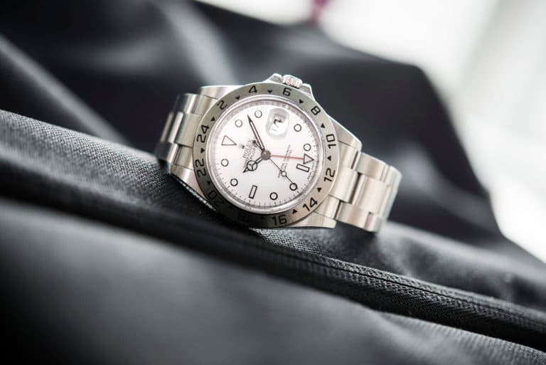
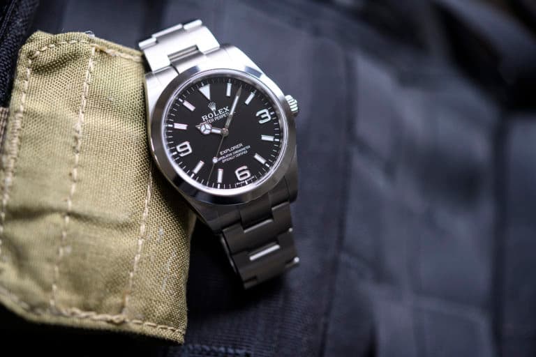
Watches like this Hublot highlight 2 different schools of thought when it comes to wearing watches in this very digital era. The first recognizing the watches role as a practical and useful tool to be used as originally intended, and the second which admits the outdated role of a watch, placing it in the realm of jewelry. Reality falls somewhere in between, but I’d argue that watches are what we make of them as individuals. For me, watches are a useful every-day tool. I use mine to check the time, and I prefer it fade into the background when I’m not using it. That means it should be manageable in size and weight, and certainly not inhibit my ability to perform basic physical activities. Therein lies my issue with the Hublot ABGBBK, it is impractical in that it doesn’t allow a normal range of wrist movement, and doesn’t fade away on my wrist when not in use. The image below highlights the issue rather dramatically, the Explorer II sits flat to, and within the confines of my wrist.

As worn next to my daily wearer, a Rolex Explorer II 16570.
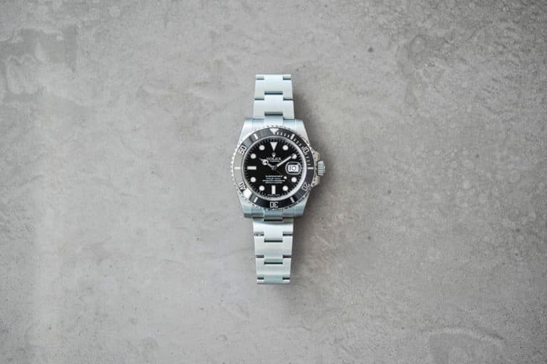
I’ll be the first to admit that I’m not diving with my Submariner, and I’m not exploring cavernous breaches in the mountains with my Explorer II. But, the qualities that make these watches fit for such environments, also make them great daily companions. They are easy to read, easy to use, and easy to wear. Their cases are well considered, they slip under a shirt sleeve with ease, and their heft is barely noticeable through long stretches of wear. These are qualities I admire in a watch, regardless of brand.
The Hublot ABGBBK is a hard sell for a guy like me, but that doesn’t mean others can’t or won’t find joy in wearing it. There are qualities about this watch which I deeply respect, and what’s more, I am not the arbiter of what goes and what doesn’t in this hobby. I wear watches for personal reasons and I encourage anyone reading to do the same. The diversity of tastes and styles make the hobby exciting and, I hope, make it welcome territory for newcomers.
Conclusions
While there are certainly redeeming qualities here, this clearly isn’t a watch for me. That doesn’t mean it’s not right for you. If you have larger wrists, or are accustomed to larger watches you’ll find a fun, vibrant watch from a contemporary brand that will set you apart in a room full of APs and Rolex. If this is a style that speaks to you, I’d also recommend taking a closer look at some of Hublot’s current offerings, as they come in a range of sizes these days, and the brand as a whole has made great strides in terms of their horological prowess, with more complicated and even in-house built movements. Additionally, their novel use of materials is genuinely impressive and begs a look into the future, rather than the past, for inspiration. Something more brands would benefit from, these days.

